Holding Periods and Volatility Infographic
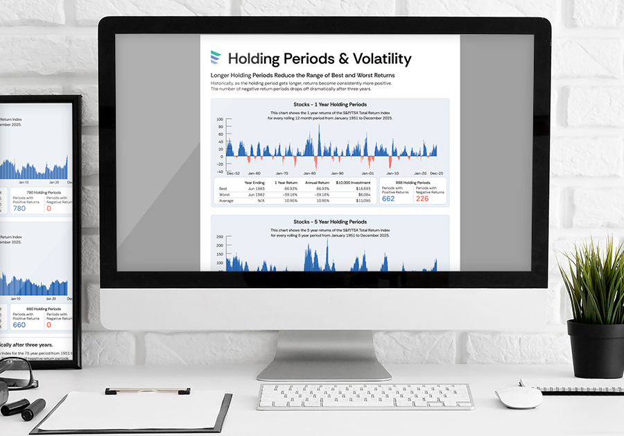
For clients who are concerned about volatility in the markets, this FreshPlan Holding Period infographic illustrates how longer holding periods reduce the range of best and worst returns on stocks.
The number of positive return periods increase dramatically after three years. The charts illustrate the 1, 5, 10 and 20 year trailing returns for the S&P/TSX Total Return Index for the 75 year period from 1951 to 2025. There is much volatility when looking at the one year trailing returns graph (or one month in the companion calculator). However, the number of negative return periods drops off dramatically after three years. For example, there are only 15 negative holding periods for 5 year periods and none for the 10 and 20 year periods.
Returns for all periods are measured using the closing month end values of the S&P/TSX Total Return Index from January 1951 to December 2026. The annual return is the annualized compound rate of return.
FreshPlan also includes companion calculators for Holding Periods and Volatility where you can compare 1 month, 1, 3, 5, 10, 15, 20, 25 and 30 year trailing returns for the S&P/TSX Total Return Index for the 75 year period from 1949 to 2023.
- Stocks and Holding Periods
- Stay Invested
- Time to Recover
“As the holding period gets longer, the returns become consistently more positive.”
Infographic Features
- Communicate complex concepts with vibrant, sharable, easy-to-understand infographics
- Personalized for individual Advisors
- Current and timely for client communications
- One of many infographics included in FreshPlan software
Calculate. Educate. Plan.
Communicate complex concepts from all areas of financial planning with current, visual infographics.
FreshPlan combines 75 calculators with powerful infographics and planners to provide advisors with a visual, easy-to-use, time saving planning and education tool and can be accessed anywhere, anytime using any device – phone, tablet, iPad, laptop or desktop.


