Market Volatility and Long-Term Investing: A Historical Perspective
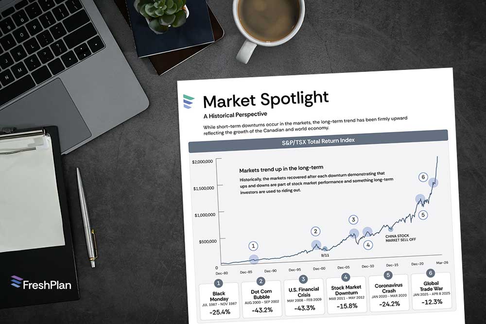
Market ups and downs are a normal part of investing, but history shows that markets have consistently recovered over time. The Market Spotlight infographic helps clients see market volatility in context by showing how the Canadian stock market has responded to major downturns.
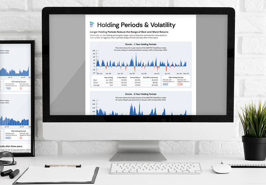
Using historical performance of the S&P/TSX Total Return Index, this infographic highlights key market declines alongside the long-term upward trend. It reinforces an important message: short-term downturns happen, but long-term growth has historically rewarded patient investors.
“This infographic illustrates historical performance of the S&P/TSX Total Return Index for an investment in 1980”
What This Infographic Shows
The Market Spotlight infographic highlights several well-known market downturns, including:
- Black Monday (1987)
- Dot-Com Bubble (2000–2002)
- U.S. Financial Crisis (2008–2009)
- Stock Market Downturn (2011–2012)
- Coronavirus Crash (2020)
- Global Trade War (2025)
It also emphasizes two important insights:
- Markets have historically recovered
- Despite temporary declines, markets have shown resilience over time.
- Recovery often happens within a reasonable timeframe
On average, these downturns recovered in about 17 months, reinforcing the importance of staying invested.
How Advisors Use This Infographic
This piece works especially well during uncertain markets when clients may feel anxious about their investments. Advisors often use it:
- During periods of market volatility
- In annual or review meetings
- When introducing long-term investing concepts
- In client emails or newsletters
- On social media during market downturns
Its visual format helps clients quickly understand that volatility is expected—and temporary.
Helping Clients Stay Focused on the Long Term
Market headlines can create anxiety, but historical perspective can build confidence.
The Market Spotlight infographic helps clients understand that downturns are part of investing and that staying focused on long-term goals is often the most effective strategy.
For advisors, it’s a practical tool that supports calm, informed conversations when clients need reassurance the most.
