Investment Time Horizon Infographic
Helping clients understand risk is one of the most important conversations in financial planning. The Investment Time Horizon Infographic gives advisors a clear way to demonstrate how portfolio outcomes change depending on how long investments are held.
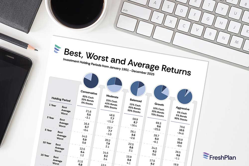
Using historical Canadian market data, this infographic highlights the best, worst, and average returns for five common portfolio types—from conservative to aggressive—across holding periods ranging from 1 to 30 years. The message is simple and powerful: time plays a major role in reducing the range of possible outcomes.
“A visual way to show how time reduces uncertainty in investing.”
Rather than focusing only on averages, this infographic helps clients see the full picture—including the variability that can occur over shorter periods and the stability that tends to emerge over longer ones. It supports meaningful conversations about risk tolerance, patience, and staying invested through market cycles.
What This Infographic Helps Clients Understand
This visual tool makes several key investment concepts easier to explain:
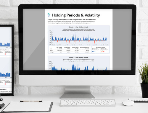
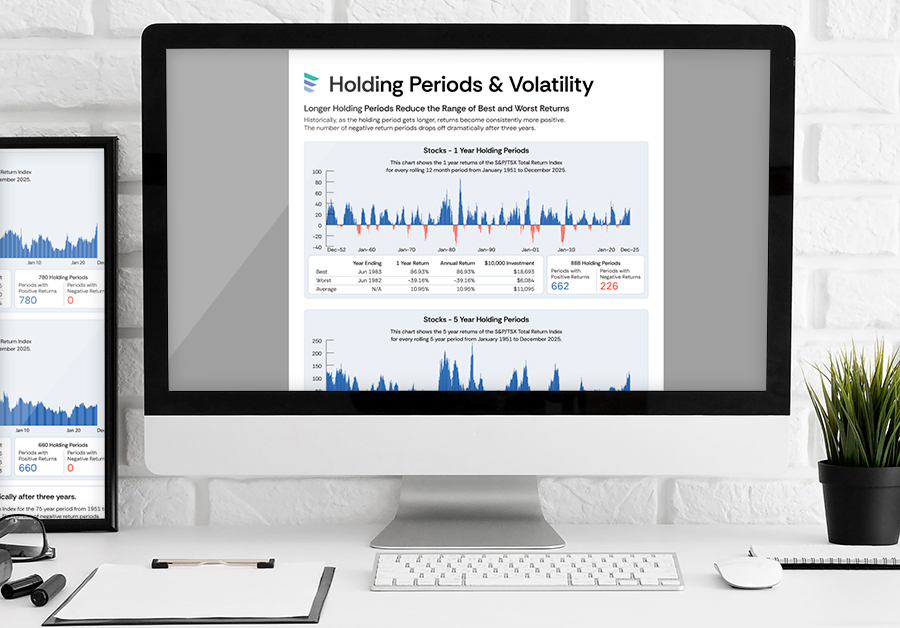
- Short-term returns can vary widely—especially in portfolios with more stocks
- Longer holding periods tend to reduce the chance of negative outcomes
- Portfolio mix influences both potential growth and short-term volatility
- Staying invested over time helps smooth the ups and downs of markets
- Risk discussions become easier when clients can see historical ranges
It’s particularly effective when clients are feeling uncertain about market swings or questioning whether their current strategy still fits their goals.
Portfolio Types Included
The infographic compares five diversified portfolio mixes, each rebalanced annually to maintain its target allocation:
- Conservative: 80% Cash, 20% Bonds
- Moderate: 25% Cash, 45% Bonds, 30% Stocks
- Balanced: 15% Cash, 35% Bonds, 50% Stocks
- Growth: 10% Cash, 20% Bonds, 70% Stocks
- Aggressive: 5% Cash, 5% Bonds, 90% Stocks
Returns are based on widely recognized Canadian benchmarks:
- Stocks: S&P/TSX Total Return Index
- Bonds: Canada 10-Year Government Bond Total Return Index
- Cash: Canada Treasury Bill Total Return Index
This ensures the data reflects long-term Canadian market experience and remains relevant for client discussions.
Pairing With Other Tools
The Investment Time Horizon and Returns Infographic works particularly well alongside calculators that explore probability and long-term investing behaviour.
Suggested companion tools include:
- Rate of Return Odds Calculator
- Stock, Bond and Cash Allocation Calculator
- Stocks and Holding Periods Calculator
Together, these tools help advisors move from concept to application—turning insight into action.
